Deepin is advancing more forceful paces again. This time we are going to improve the official website, along with the community site and so on. There will be comprehensive and big changes in them!
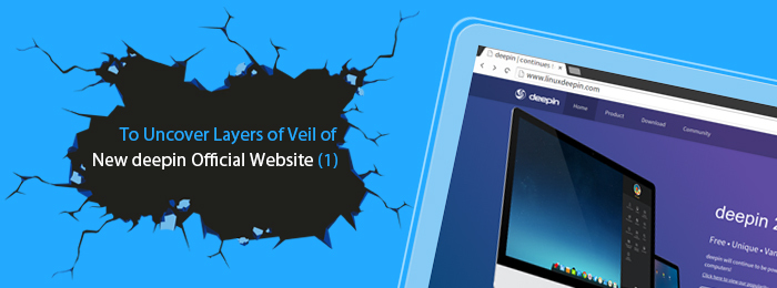
Last week a design picture of the new deepin official website was revealed on deepin official SNS. Unexpectedly, we received a warm response from users at home and abroad. We certainly understand our small partners' feelings of eagerly expecting it, so now, please follow us to uncover the mystery veil of our new official website!
Great Structure Adjustment
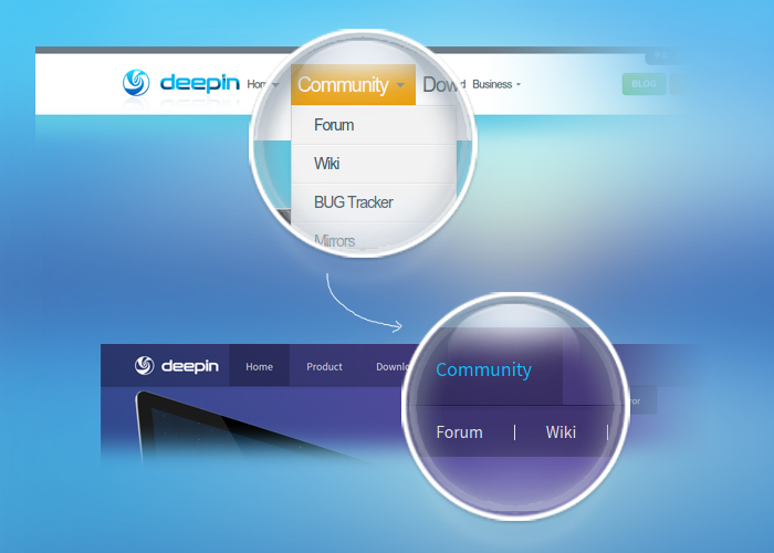
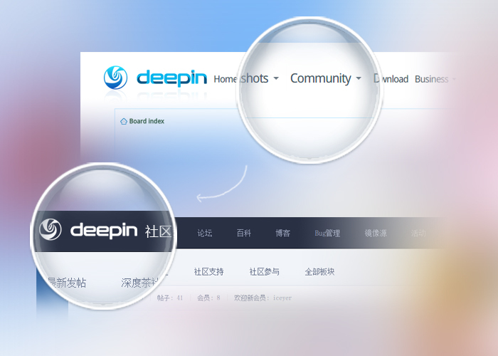
One of the biggest problems of the current official website is the hierarchy being single but the content classification being complex, which will be improved overall in the new website. Most importantly, the community site will be set as an independent and new hierarchy. The new official website will mainly include two parts—the official main site and community site.
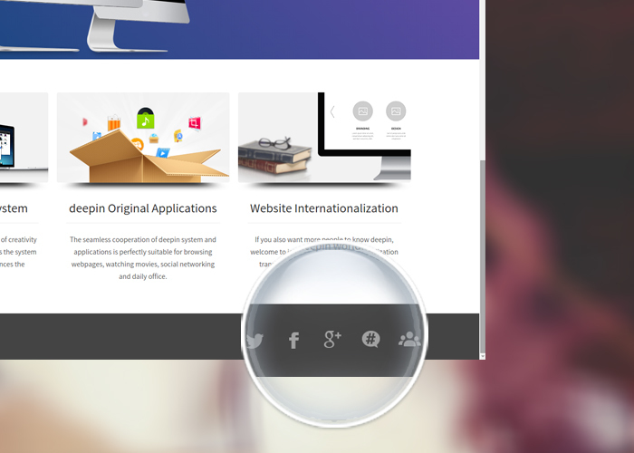
The accounts for deepin social platforms will be placed on the bottom of the website collectively, which will facilitate users to follow us and get information.
Simple Design Style
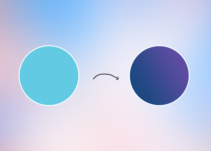
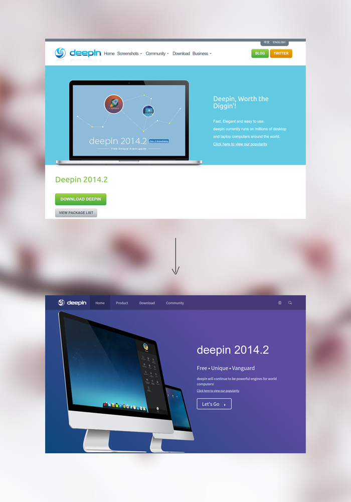
The new website adopts the fashionable and concise flat style, and the main color tone changes from the originally single sky blue to the mixed tone of blue and dark gray, which makes you visually feel that it’s more hierarchical and has more sense of design.
The content of the web page will be more concise, because of which, the experience will be more straightforward and convenient.
Considerate New Features
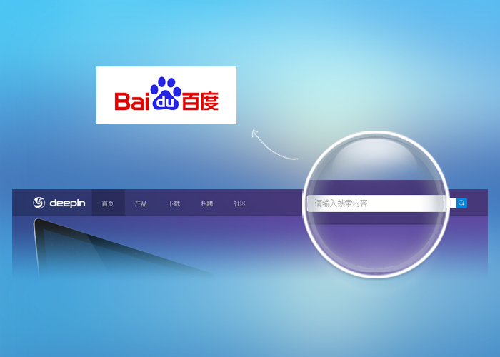
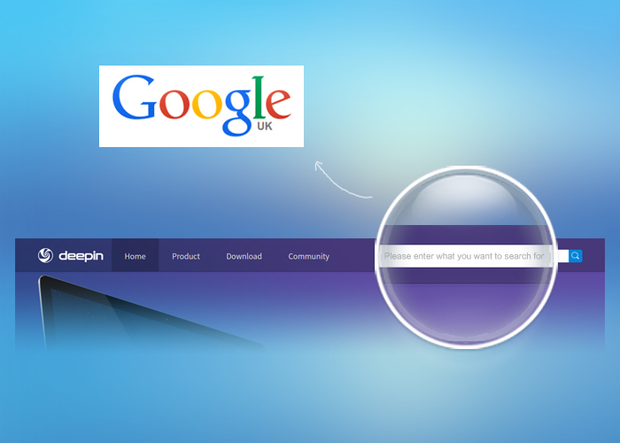
The feature of searching in the whole site is added in the new official website. You can use Baidu to search in the simplified Chinese version of the site and Google to search in the version of English and other languages.
The feature of the window adapting automatically is newly added. No matter the window is enlarged or reduced to any size, the web page will automatically adjust itself to the corresponding proportion according to the window size, which makes you browse it more conveniently.
The above is the content that has been finished being changed in our new official website, whose beta version is planned to be released and meet you in early April. We welcome you to put forward your valuable comments and suggestions.
In addition, there are other new features and changes in our new site in the womb of time, such as multi-language support, and so on. As for something more, we’ll keep you guessing. Please await the formal launch of our brand- new website!
Related: To Uncover Layers of Veil of New deepin Official Website (2) >>
看完了,希望deepin越做越好,最后是卖个关子,不是买 :)
已经修改,谢谢提醒!
赞一个,很期待。
不错,支持一下啊。
论坛:贴子,左键单击,在新标签打开
请问是需要默认打开帖子以新标签的方式打开吗?
但是常规所被大众接收的是在当前标签直接打开,如果你的确需要这个功能,你可以按住Ctrl+鼠标左键点击实现这个功能。
过来支持下。
虽然使用Deepin 的过程中,有很多不愉快和卡顿,但还是非常支持国产的自主创新。
Deepin 就像创造新桌面一样,脱离Ubuntu,有自己真正的发行版。我看好你!
谢谢支持哈,我们会不断完善自己的产品的!
终于有自适应和多语言了。