Along with the release of Deepin 2014 Alpha, we have received much of our users’ feedback on using it. Here we want to express our gratitude to every friend.
Since the new Dock is under development, some of its new functions haven’t been realized. Many users don’t know where the trays are. Hence, we will give a brief introduction on the design concept of our new Dock and trays so that users can understand it better.
First of all, let’s have a look at the layout of our new Dock.
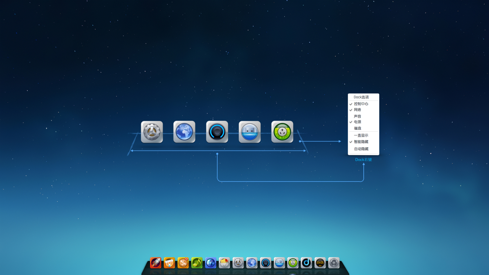
The new Dock is made up of two parts--the traditional Dock & tray (system-level and program-level). When you click the Dock panel, the functional options(display of tray of system-level and display of Dock) will pop up. In this way, our users can customize the displaying way of trays of system-level and that of Dock.
We'll not repeat the functions of traditional Dock. we are now mainly focusing on the tray design.
System-level
System-level trays
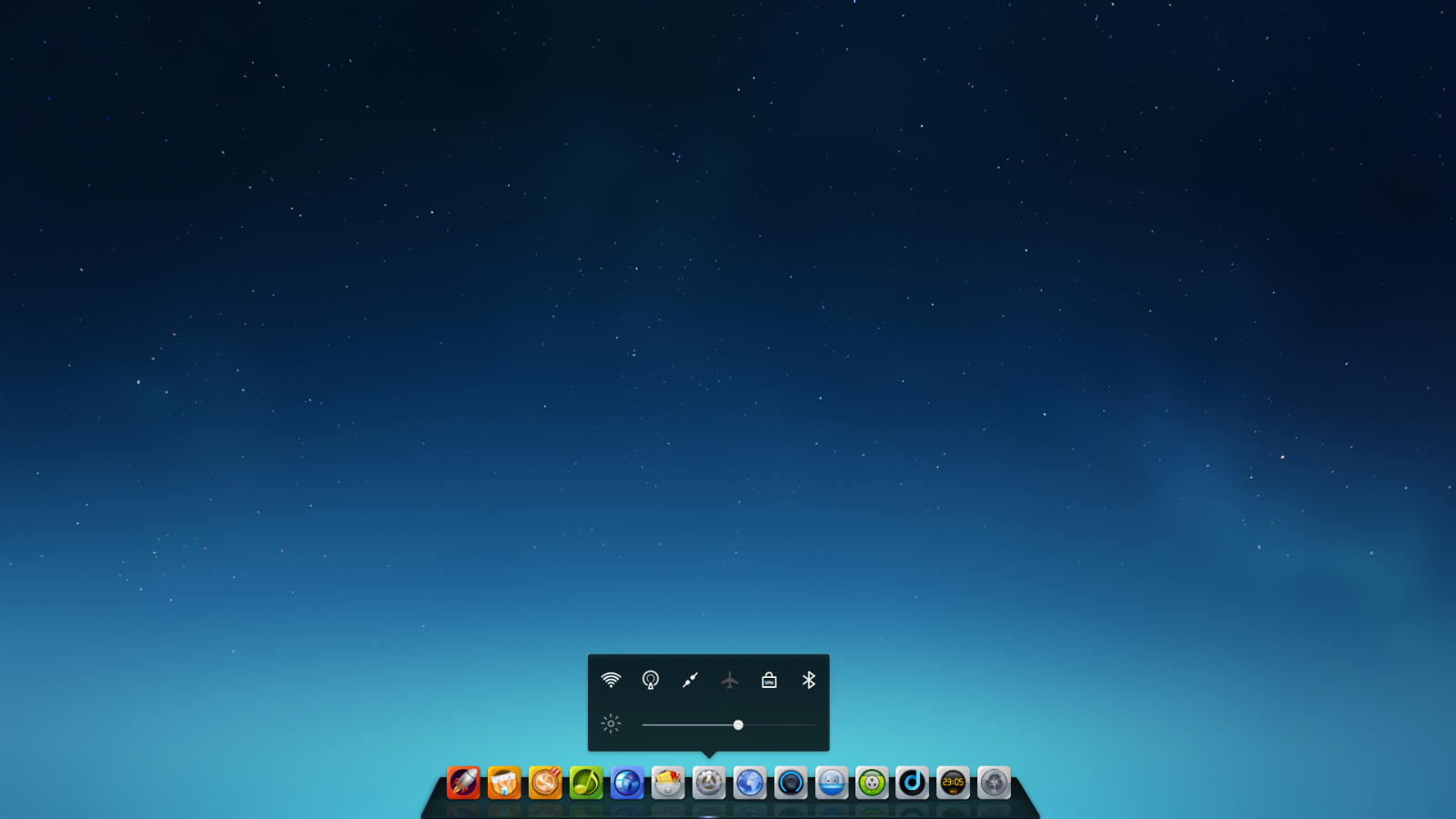
"System state control" function will automatically pop up if the mouse pointer hovers over the system state tray.
The “system setting” page will pop up if you left click the system-state tray.
The "run" and "undock" functions will pop up if you right click the system-state tray.
Network tray
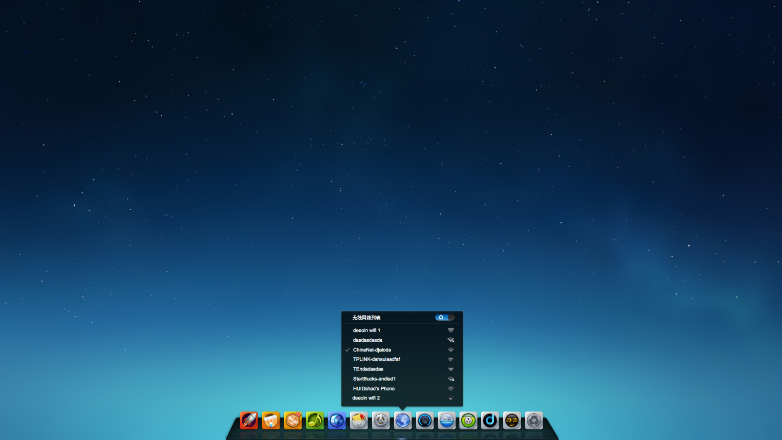
The “network state control” function will pop up automatically if the mouse pointer hovers over the network tray.
The “system setting-network” page will pop up if you left click the network tray.
The "run" and "undock" functions will pop up if you right click the network tray.
Audio tray
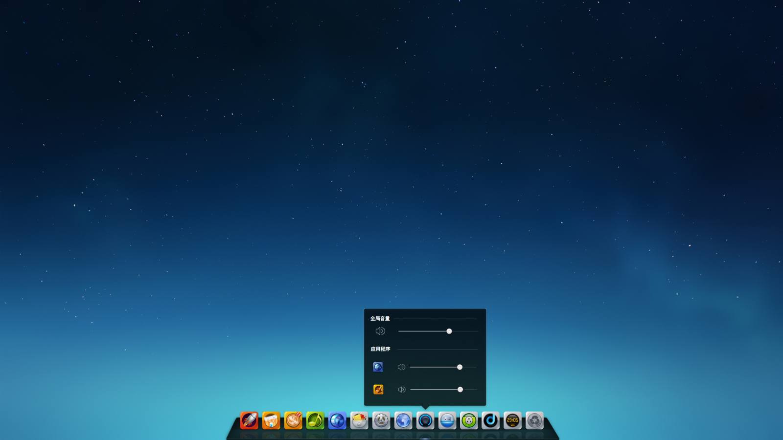
The “audio control” function will pop up automatically if the mouse pointer hovers over the audio tray.
The “system setting-audio” page will pop up if you left click the audio tray.
The "run" and "undock" functions will pop up if you right click the audio tray.
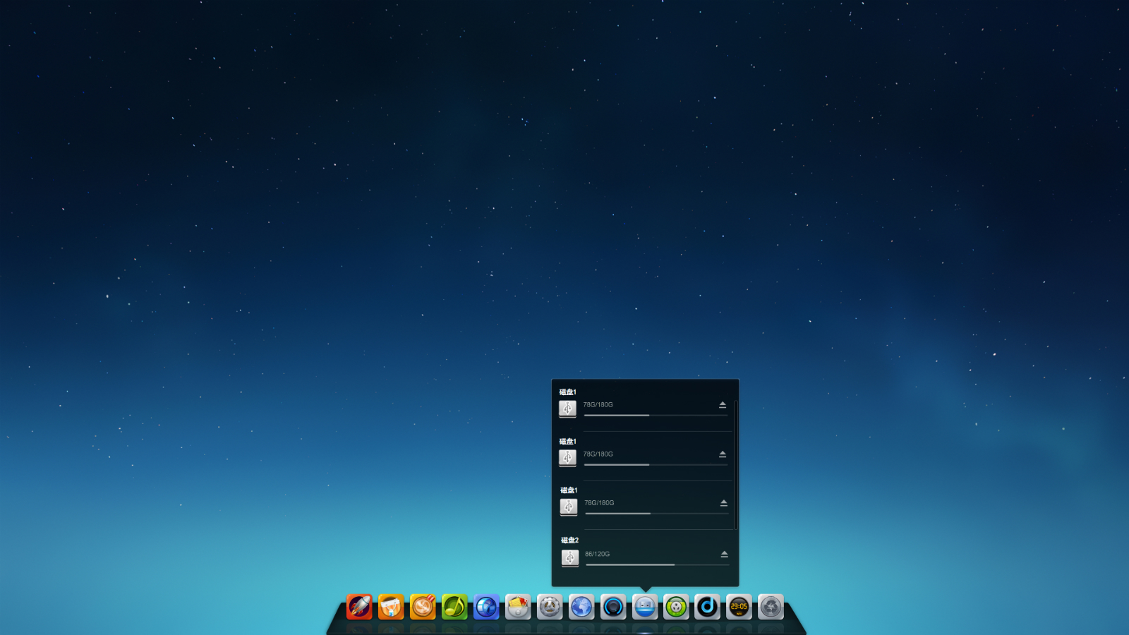
USB device tray
The “USB device control” function will pop up automatically if the mouse pointer hovers over the USB device tray.
The “system setting-default program (auto-play)” page will pop up if you left click the USB device tray.
The "run" and "undock" functions will pop up if you right click the USB device tray.
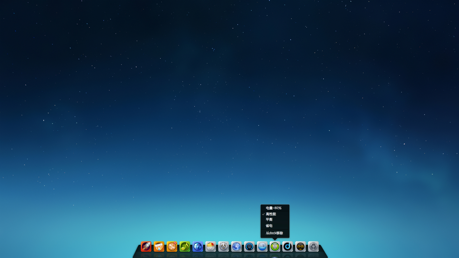
Power tray
The current quantity of electricity will be shown automatically if the mouse pointer hovers over the power tray.
The “system setting-power” page will pop up if you left click the power tray.
The “power control” and "undock" functions will pop up if you right click the power tray.
Program-level tray
"D Zone"
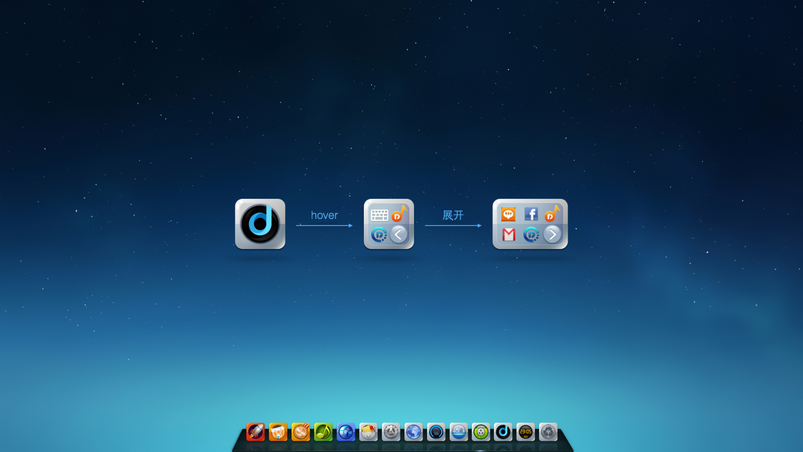
Since Deepin 2014, we assemble all trays of program-level in the “D Zone” for convenience of users’ managing trays of program-level.
More trays of program-level will be shown if you click the “expand” button in the “D Zone”.
“All trays of program-level” will pop up automatically under auto-switch if the mouse pointer hovers over the “D Zone” tray.
The corresponding program will pop up if you left click one of the trays of program-level shown in “D Zone”.
The menu of the right-hand button of the corresponding program will pop up if you right click one of the trays of program-level shown in “D Zone”.
Other functions
The “show/hide desktop” function will be booted if you left click the Dock panel.
The “Dock display” function will pop up if you right click the Dock panel.
Conclusion
That’s all for the introduction of the design of our new Dock. You are welcome to leave a message to share with us any of your ideas or give us any improvement suggestions on the new Dock.
Haha, maybe you will have an opportunity to do interactive online-talk with our beautiful designers. Don’t miss it!
Follow us: Our Website | Forum | Twi
Facebook(English)| Facebook(Chinese) | Google+ | Distrowatch
颠覆,,,然后,,,D区够放那么多个程序图标吗?
有展开按钮的啦,现在更新系统应该可以看到了吧
D区那个,如果图标多了咋办~~
有展开按钮的啦,现在更新系统应该可以看到了吧
我更关心你们的文件管理器是否漂亮,光这个桌面漂亮感觉实质不大,只算是表面功夫。
The File Manager will come true in 2015
我觉得系统状态托盘很实用,有点像手机,但是引入这个功能很不错
感觉跟苹果的有些神似。
怎么老是放到底部. 放右边多好.
别扭,占空间,能切换回传统的dock样式吗
目前不提供这样的模式哈
噢,actually,不错,但是,值得商榷,这样的系统托盘显示,给人拥挤以及混乱,单行排列应该是最好的,,,就例如win7托盘的上拉三角形,如果有接近十个的图标显示,你会发觉错综复杂,这也许就是为什么需要一个三角形来让它隐藏起来,这确实影响美观,,,
其实,我还没明确团队内部这UI设计上的确定原则,是要易用?还是仅仅不遵循传统?
为什么不能提供Dock和类似于Windows任务栏切换呢
因为只能有一个,多个不利于图标的设计跟布局的安排,多个的话只能交给社区爱好者自行写一些类似win下的酷鱼跟雨滴之类的桌面应用,目前倒是还没见过哪个发行版提供多个任务栏的,包括dock。。。
[…] via:Deepin […]
个人觉得音量调整还可以提升一点,就是当鼠标移动到DOCK音量图标上滚动鼠标滚轮可以直接调整音量大小。同时可不可以这样。将电脑的屏幕分成左右两个控制区,比方停在右半边时,按住鼠标右键的同时滚动鼠标滚轮也是调整音量大小,停在左半边时,按住鼠标右键的同时滚动鼠标滚轮则是调整屏幕亮度!个人观点,不合理勿喷呀!
我觉得控制中心的侧栏也要继续优化,现在阿拉法版的感觉没啥质感……不如dock有质感
在想当图标满了的时候应该怎么办……
Dock 可以放在左右侧面吗?像win下面任务栏一样,可以拖动到左右侧面就很好,
有难度,会不会需要弄个新手提示
日期作为一个dock图标来展示,总感觉四不像,而且容易误解!
我感觉啊,是不是可以日期不放在dock上,
单独弄一块区域来显示,由于这块区域单独显示日期看着太单调,可以加一些其它的信息、或者是在托盘上做文章。此上个人见解,欢迎大家讨论。
这样的设计不好!本来放置快速启动程序的地方,却放了这几个系统级的为了显示状态的图标占了那么多地方,而且容易和程序图标混淆,不清晰直观.windows和os x的状态信息就比这个好.
没法真正全屏?dock不能自动隐藏?还是可以在哪里设置?宽屏,dock占了很大空间
找到了,不过好像不太灵敏,没法设置吗?
我是正式版,为什么D区不起作用啊!!悬浮左键右键均无反应!
装完deepin2014电deepi脑不能进入win8。只是deepin。而deepin2013可以双系统。
请进入Deepin终端执行命令:
sudo update-grub进行控制中心的开机启动模块选择你想要启动的系统。